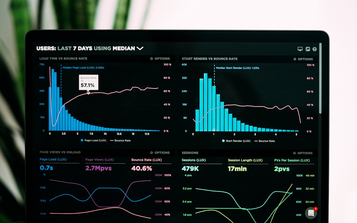
Charts answer “what happened.” They’re terrible at “why.” The conversion rate dropped from 12% to 9% — great, now what? Every minute spent guessing is a minute the fix is late. Session context closes the loop: from the number, to the behavior, to the specific step that broke.
The funnel is a door, not a diagnosis
A funnel tells you where users leave. It can’t tell you if they left because the button was hidden, the page was slow, or the pricing confused them. Those are three different fixes with the same chart.
The path from “where” to “why” runs through individual sessions:
- Which route did they take?
- What device and connection were they on?
- Which events fired — and which ones stopped?
Rewind, don’t reconstruct
This is where realtime matters twice. First, the metrics update live. Second — and less obvious — the context is fresh. A session from this afternoon comes with its full event trail attached, ready to inspect. You’re not waiting for a replay to be stitched together overnight; you’re watching yesterday’s problem with today’s detail.
The workflow we recommend:
- Notice a funnel step dip in real time.
- Click into the step — Vireo shows the sessions that passed through it.
- Spot the pattern: same device class, same region, same route, same dropped event.
- Fix the thing, and watch the funnel recover in the same session.
Why teams stop guessing
The subtle payoff isn’t faster bug fixing — it’s that your team stops arguing about causes. When a hypothesis can be checked against real sessions in minutes, the loudest voice in the room stops winning by default. Decisions get made from evidence, and that changes the whole culture of the product org.
The “what” tells you something moved. The “why” tells you what to do about it. Tools that give you only the first leave you with a very expensive chart.

Mobile Engineer at Vireo